We have created a new release again with some goodies! There are two big additions: Spanish translation and a brand new dark theme. We have many users from Spanish speaking countries, this translation helps them to understand the app easier.
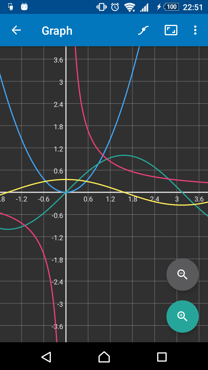
The dark theme was asked by many. Most people found the current light theme too bright when working during the night. The new theme is easier on the eyes — and lots of people will find it simply prettier than the original light theme. Checkout the screenshots below and decide for yourself!


Other changes include a small visual improvement of the square root sign and speeding up the calculation engine code a bit. The latter one is hard to notice as the calculator is already quite fast!
